


About the Project
About the Project
About the Project
Embarking on a task assigned by Omnify as part of the screening process for a summer internship, I was tasked with the complete reimagination of the UX and UI for their booking service flow. The challenge involved overhauling the user experience and interface design to enhance the overall usability and aesthetic appeal of the booking service. My approach encompassed user research, wireframing, prototyping, and iterative design to deliver a transformed and user-friendly booking experience.
Duration for completing the project was 3 days.
Design Brief given by Omnify
Design Brief given by Omnify
Design Brief given by Omnify
a
a
a
Confusing Interface
Confusing Interface
The users are facing problems picking the most suitable class based on their level of expertise since they find the current filtering UI too confusing - and none of the listing cards mention these levels.
The users are facing problems picking the most suitable class based on their level of expertise since they find the current filtering UI too confusing - and none of the listing cards mention these levels.

Lack of Information
Lack of Information
Customers have also mentioned that there was a lack of information regarding the Instructors who were going to handle the class or take appointments - for them to be able to book the right class based on the instructor’s knowledge and expertise.
Customers have also mentioned that there was a lack of information regarding the Instructors who were going to handle the class or take appointments - for them to be able to book the right class based on the instructor’s knowledge and expertise.

Confusing Journey
Confusing Journey
Customers have also complained about the user journey being too confusing for them when they need to Sign up/ sign in to the business’ web store, select an appropriate service, book a time slot based on availability and make a payment after reviewing their booking at the checkout page.
Customers have also complained about the user journey being too confusing for them when they need to Sign up/ sign in to the business’ web store, select an appropriate service, book a time slot based on availability and make a payment after reviewing their booking at the checkout page.

My Approach
My Approach
My Approach
In my exploration of the website interface and the booking flow, I delved into each step to identify potential user challenges. Analyzing the entire process, I pinpointed areas where users might encounter difficulties. Additionally, I conducted a thorough assessment of the website interface to distinguish between essential and unnecessary features. With the goal of enhancing user experience and effectively conveying information about various exercises and features, I proposed solutions to streamline the interface and optimize user engagement across different categories.
In my exploration of the website interface and the booking flow, I delved into each step to identify potential user challenges. Analyzing the entire process, I pinpointed areas where users might encounter difficulties. Additionally, I conducted a thorough assessment of the website interface to distinguish between essential and unnecessary features. With the goal of enhancing user experience and effectively conveying information about various exercises and features, I proposed solutions to streamline the interface and optimize user engagement across different categories.
In my exploration of the website interface and the booking flow, I delved into each step to identify potential user challenges. Analyzing the entire process, I pinpointed areas where users might encounter difficulties. Additionally, I conducted a thorough assessment of the website interface to distinguish between essential and unnecessary features. With the goal of enhancing user experience and effectively conveying information about various exercises and features, I proposed solutions to streamline the interface and optimize user engagement across different categories.
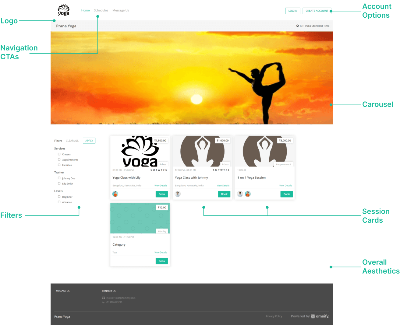
Finding Interface Problems
Finding Interface Problems
Noting the UX Problem for booking a session
Noting the UX Problem for booking a session
Noting the UX Problem for booking a session
a
a
a
Step 1
Step 1
Step 1
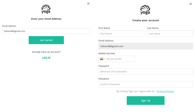
Create an account
The first step to book a class one needs to create their account which occurs in a two step process i.e. fill their email address and then in the second step they need to fill in their credentials in a new screen with the email address as a non editable field.
Problems Identified:
The problem that I feel with the process is that there is no visual cue for making the user feel that they have typed the correct mail address and in the nest page there is no back button so that the user can go back to rectify it.
The other one was the breakdown of the process because in the first step there was only one editable field and in the second one there was the main screen where the account creation takes place.
Also there was no message dialog box if the account creation is successful or not.
Step 2
Step 2
Step 2
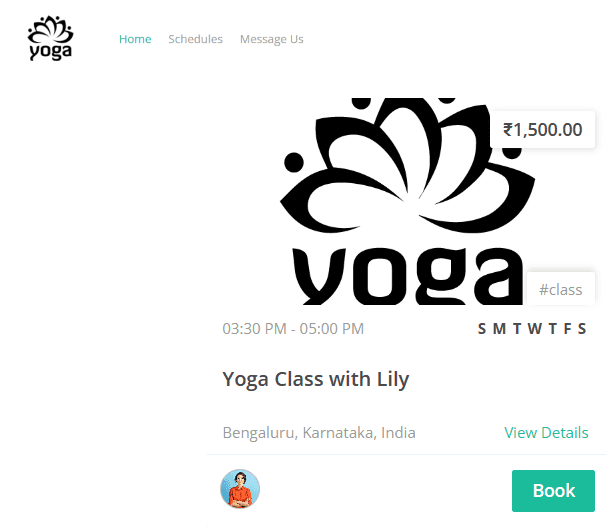
Select a class
For booking a class the second step of the process is browsing among the various sessions present in the home screen or clicking on the schedule tab present on the top navigation bar.
Problem Identified:
Although the cards have ample information but the most problematic area is the way the information hierarchy is displayed along with the other basic information that would convert a potential user into a customer like no information about the instructor, clear indication of the time schedule or the intensity level etc.
Second the card clearly indicates only one class timing but when you land on the schedule page there the user is shown with different class timings which is misleading.
Step 3
Step 3
Step 3
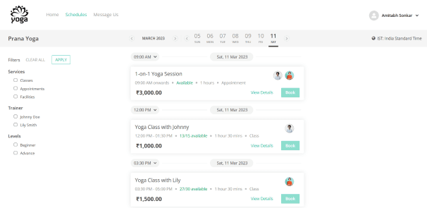
Schedule the class
As explained in the previous step if the we follow the schedule tab on the top nav we land on the same page if we click on any card. Here the user can choose among different class schedules or pre register for the future classes.
Problem Identified:
The information hierarchy is not good one needs to read all the data points to reach a conclusion.
Although filter section will help the user to reach a conclusion faster but some of the information or filter options are missing in both filter section and the card details like timings, class ratings etc.
Step 4
Step 4
Step 4
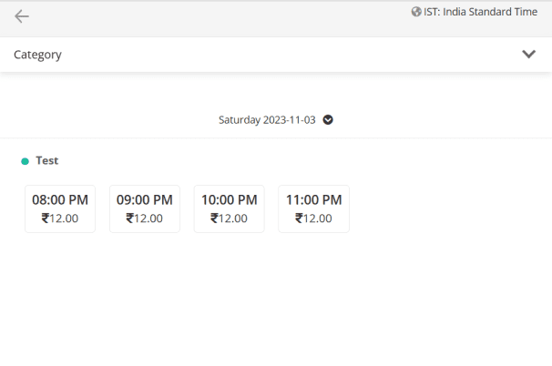
Choosing class timing
Once the user chooses a class that he wants to attend he lands on a screen where he needs to choose a timing which is suitable for them.
Problem Identified:
The most critical problem with this process is that in the previous page where it is clearly indicated that the class is scheduled 9:00 AM (let say) onwards when a user lands on this page he comes to know that he can attend any session that is 9:00 AM onwards that are indicated.
In case there are multiple instructors for a class it is not indicated which class is taken by which instructor.
It is not clearly indicated which class has how many available seats.
Step 5
Step 5
Step 5
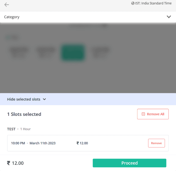
Booking confirmation
After a user selects a session he is displayed his class details and is asked to proceed to the payment section.
Problem Identified:
Here also there is no indication of who will be taking the class.
There is not option to select multiple slots if the user wants to also for whom the class is booked.
Step 6
Step 6
Step 6
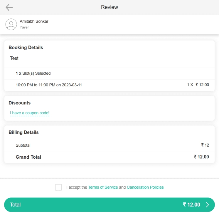
Payment confirmation
After confirming the class schedule the user then lands on the payment confirmation page where he is briefed about the cost and even have a slot for applying a discount coupon.
Problem Identified:
Although it is clearly indicated who is the payer but the user name under whose the slot is booked is not indicated.
Also the class details are also missing although it would be redundant being shown in the previous screen.
There can also be a better representation way that indicates the class price taxes etc.
Step 7
Step 7
Step 7
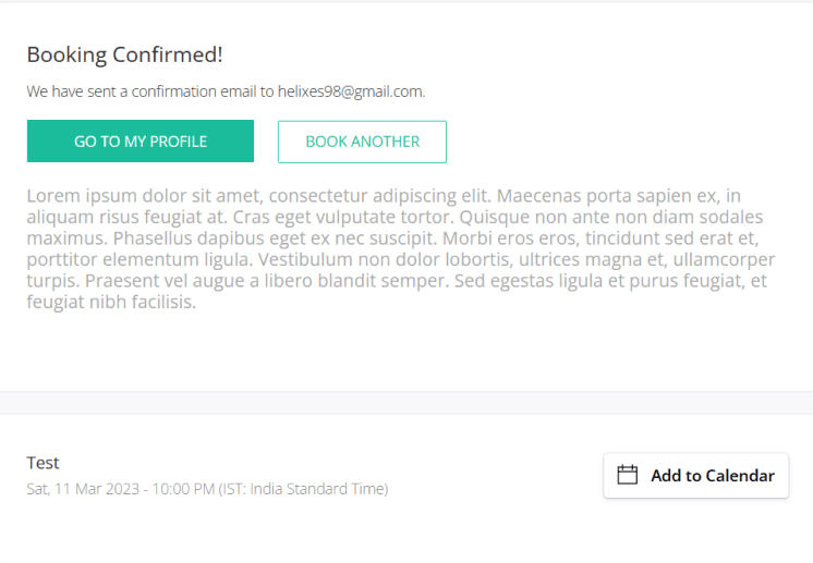
Confirmation Message
After the payment is done the user is displayed a confirmation message and if he needs to book another session of class he can from this page or can redirect to his profile.
Problem Identified:
We are given an option to direct our selves to our profiles but I think it would be better if we redirect to the home page.
We are given an option to book another session on this page but it gives a bad experience that he needs to pay for a session each time.
Figuring out the design elements
a
Figuring out the design elements
a
Figuring out the design elements
a

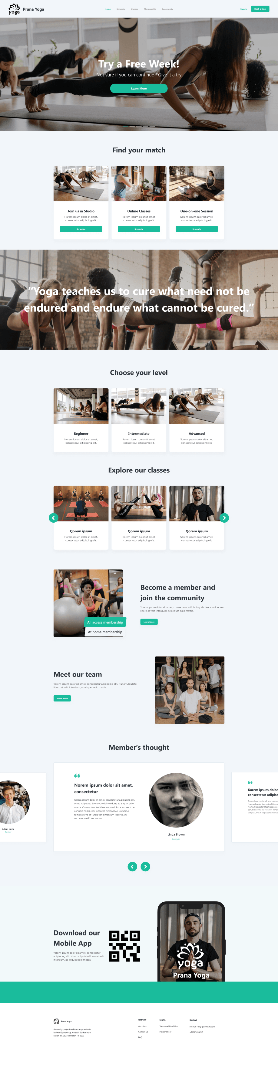
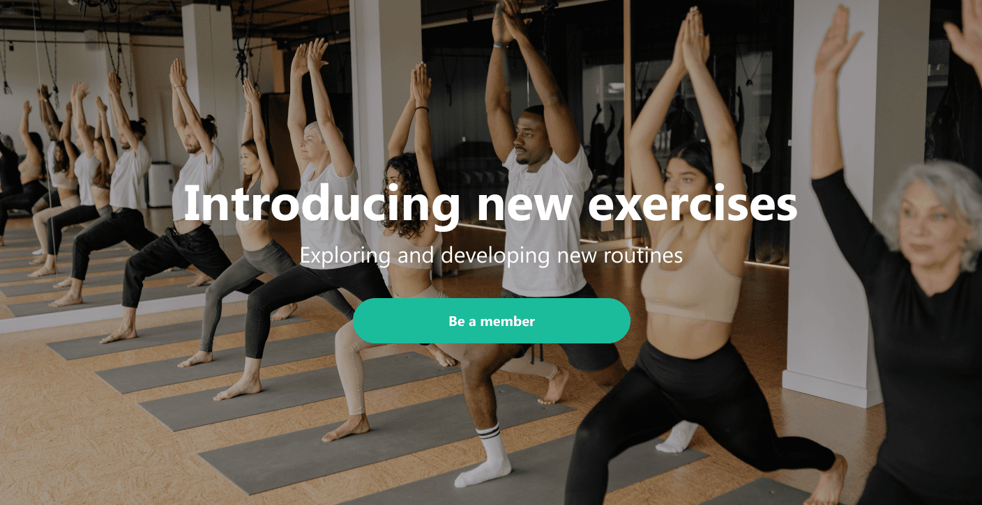
Landing Page Preview
a
Landing Page Preview
a
Landing Page Preview
a
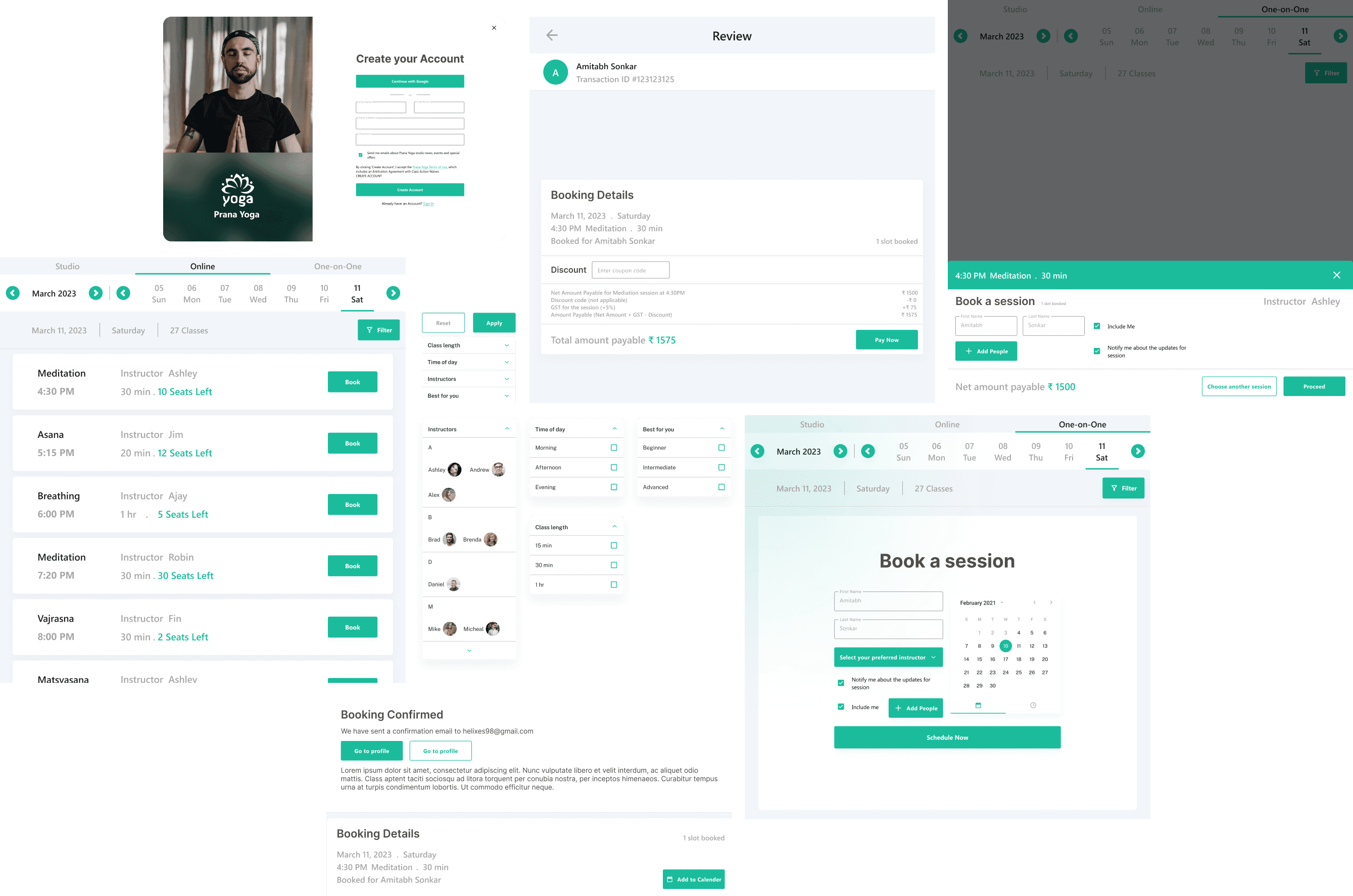
New Booking Screen Elements
New Booking Screen Elements
New Booking Screen Elements
a
a
a
Final Screen
Final Screen
Final Screen
a
a
a