

About the Project
About the Project
About the Project
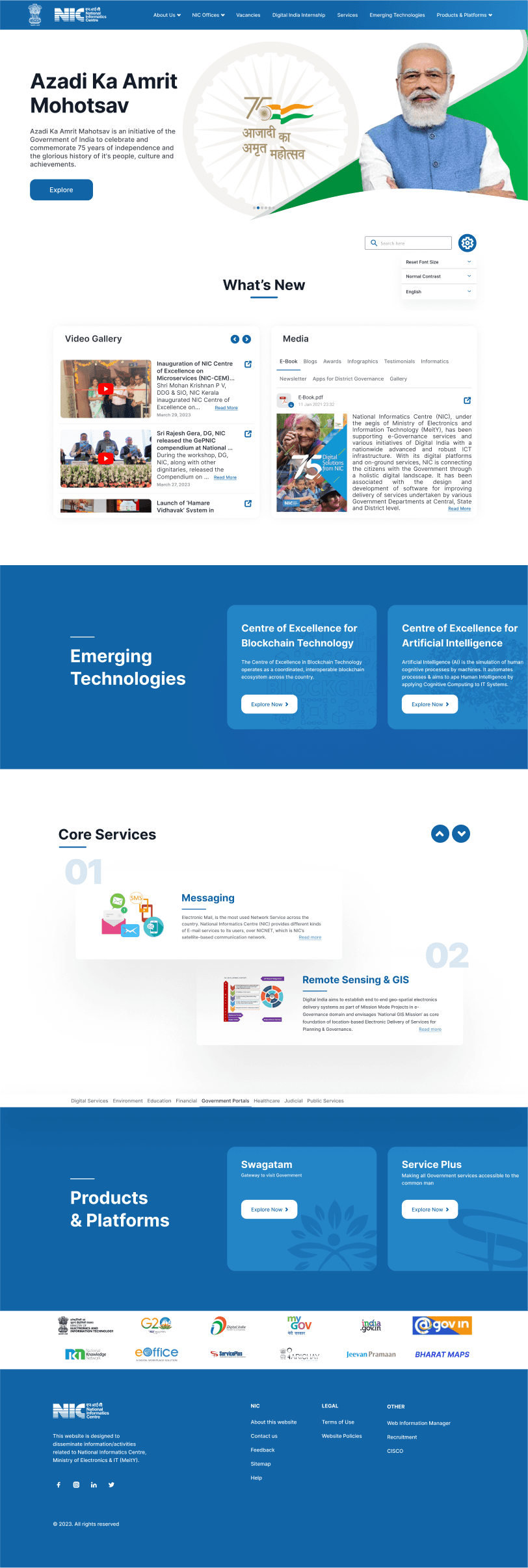
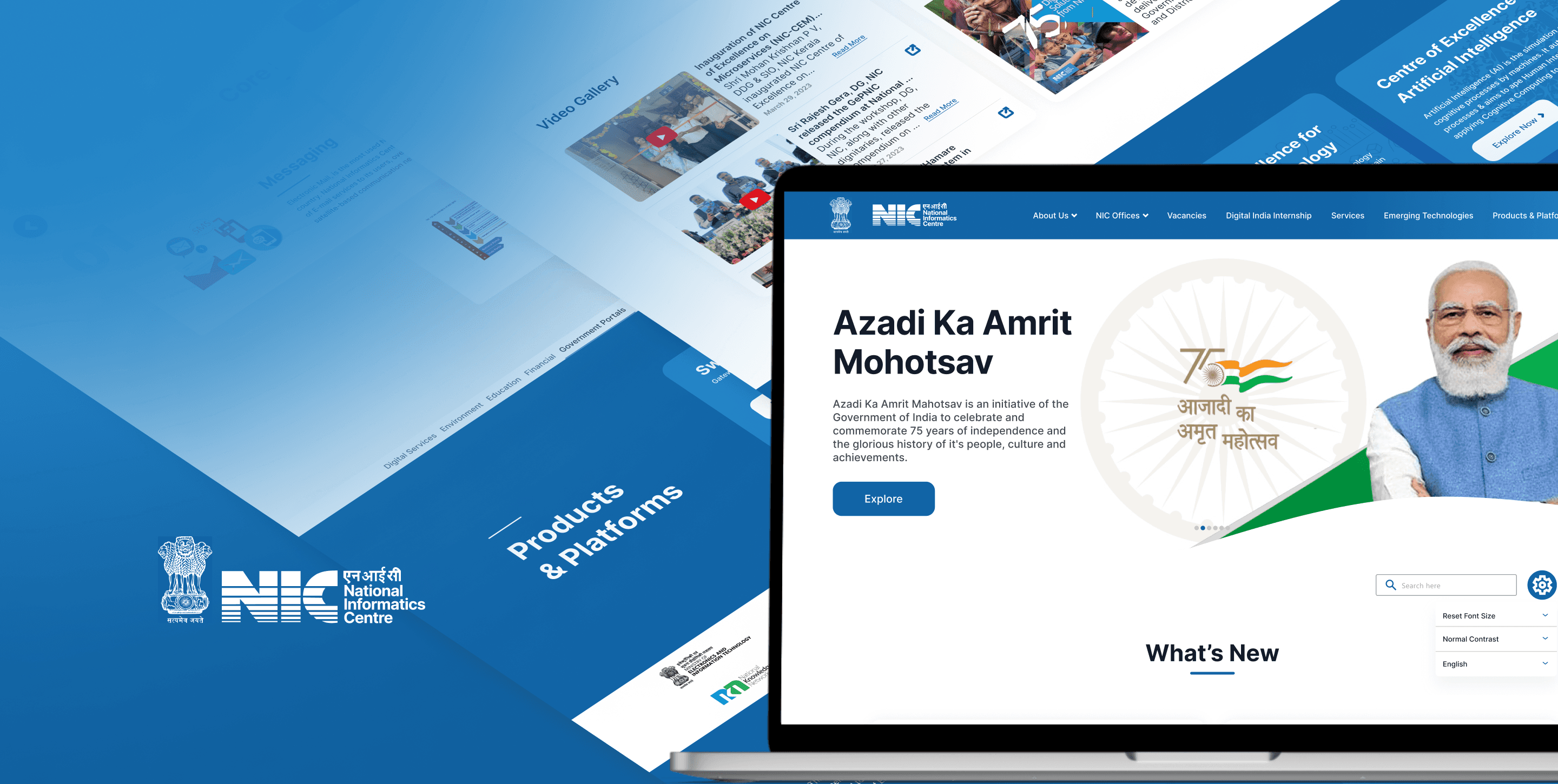
The National Informatics Centre (NIC) website is an online platform that provides information about various e-governance initiatives and services offered by the Indian government. The website is designed to be accessible to a wide range of users, including government officials, citizens, and businesses.
The objective of the project was to redesign an Indian government website to make it more user-friendly and, most importantly, to improve the User Interface, which is lacking on most government websites. Duration to complete the project was 3 weeks.
Project Goals
Project Goals
Project Goals
a
a
a
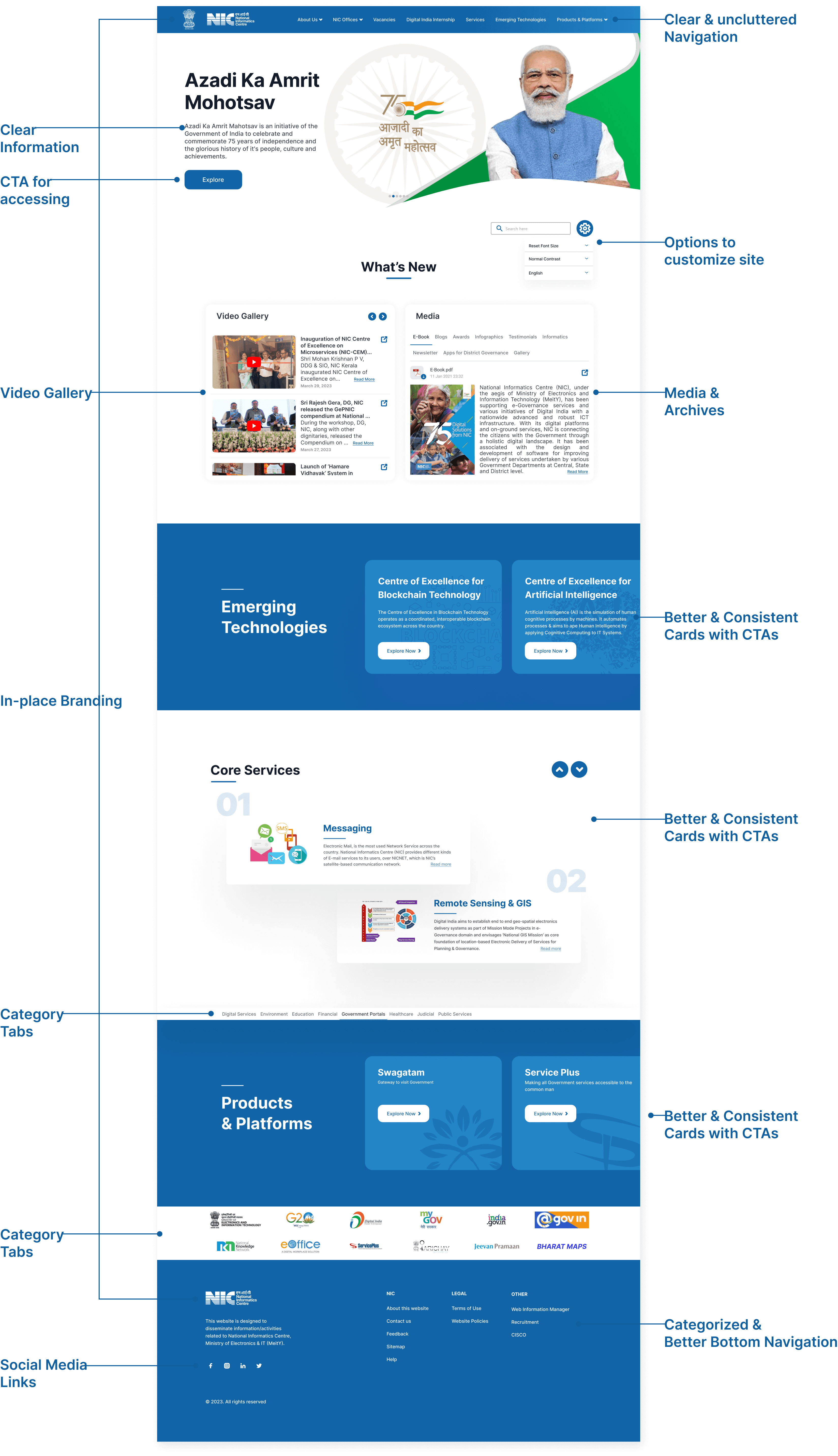
Consistent Design
Consistent Design
When an interface is consistent, users can rely on their prior knowledge and experience to predict how to use new features or interact with new elements. This reduces the cognitive load on users and helps them navigate the interface more quickly and efficiently.
When an interface is consistent, users can rely on their prior knowledge and experience to predict how to use new features or interact with new elements. This reduces the cognitive load on users and helps them navigate the interface more quickly and efficiently.

Information Architecture
Information Architecture
Information architecture is important for any interface because it helps users find the information they need quickly and easily. Information architecture is the organization and structure of information on a website or interface, including the hierarchy of pages, categories, and labels used to organize content.
Information architecture is important for any interface because it helps users find the information they need quickly and easily. Information architecture is the organization and structure of information on a website or interface, including the hierarchy of pages, categories, and labels used to organize content.

Layout & Hierarchy
Layout & Hierarchy
Layout can help to create visual hierarchy, which is the arrangement of elements in order of importance or significance. A well-designed layout will make it clear to users which elements are most important or relevant to their needs, and guide their attention accordingly.
Layout can help to create visual hierarchy, which is the arrangement of elements in order of importance or significance. A well-designed layout will make it clear to users which elements are most important or relevant to their needs, and guide their attention accordingly.

Listing the Visual
Listing the Visual
Listing the Visual
Problems
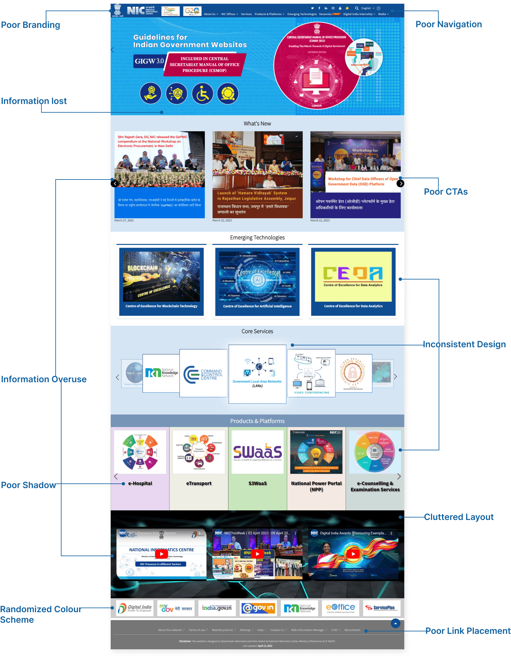
I undertook an in-depth analysis of the National Informatics Centre (NIC) website. My primary objective was to identify interface issues that hindered user experience and accessibility. Throughout this process, I encountered several key problems:
Unclear Navigation: Lack of intuitive menu structures hindered efficient browsing.
Inconsistent Design: Variation in fonts, colors, and layout detracted from visual coherence.
Poor Information Hierarchy: Critical content was buried within lengthy paragraphs, impacting readability.
Limited Accessibility: Insufficient features for users with disabilities compromised inclusivity.
Outdated Technology: Slow loading times and compatibility issues revealed an outdated infrastructure.


Creating Style Guide
Creating Style Guide
Creating Style Guide
The significance of a comprehensive style guide for the National Informatics Centre (NIC) website cannot be overstated. A style guide serves as a blueprint for consistency in design elements such as fonts, colors, and layout across all pages, thereby enhancing brand recognition and user trust. It streamlines the design process, promoting efficiency and productivity among designers and developers. Additionally, a well-defined style guide ensures scalability, enabling seamless integration of new features or sections while maintaining visual coherence. It fosters collaboration among multidisciplinary teams involved in website development and reinforces the organization's brand identity through consistent application of brand elements. In essence, a style guide is essential for creating a user-centric and visually cohesive digital experience that reflects the NIC's values and resonates with its audience.
The significance of a comprehensive style guide for the National Informatics Centre (NIC) website cannot be overstated. A style guide serves as a blueprint for consistency in design elements such as fonts, colors, and layout across all pages, thereby enhancing brand recognition and user trust. It streamlines the design process, promoting efficiency and productivity among designers and developers. Additionally, a well-defined style guide ensures scalability, enabling seamless integration of new features or sections while maintaining visual coherence. It fosters collaboration among multidisciplinary teams involved in website development and reinforces the organization's brand identity through consistent application of brand elements. In essence, a style guide is essential for creating a user-centric and visually cohesive digital experience that reflects the NIC's values and resonates with its audience.
The significance of a comprehensive style guide for the National Informatics Centre (NIC) website cannot be overstated. A style guide serves as a blueprint for consistency in design elements such as fonts, colors, and layout across all pages, thereby enhancing brand recognition and user trust. It streamlines the design process, promoting efficiency and productivity among designers and developers. Additionally, a well-defined style guide ensures scalability, enabling seamless integration of new features or sections while maintaining visual coherence. It fosters collaboration among multidisciplinary teams involved in website development and reinforces the organization's brand identity through consistent application of brand elements. In essence, a style guide is essential for creating a user-centric and visually cohesive digital experience that reflects the NIC's values and resonates with its audience.
Typeface
Typeface
Typeface
Typeface is important for an interface because it plays a crucial role in the user experience. A good typeface can improve the legibility of text, convey the tone and personality of a brand or product, and create a sense of hierarchy and structure within the interface.
Inter is a typeface that is designed specifically for digital interfaces, and it has several features that make it a good choice for this purpose.
1.
1.
1.
Firstly, Inter is a highly legible typeface, which means that it is easy to read on digital screens. It has a balanced design, with consistent stroke widths and clear letterforms, which helps to ensure that text is readable even at small sizes.
Firstly, Inter is a highly legible typeface, which means that it is easy to read on digital screens. It has a balanced design, with consistent stroke widths and clear letterforms, which helps to ensure that text is readable even at small sizes.
2.
2.
2.
Secondly, Inter has a large character set, including a range of weights and styles, which makes it a versatile typeface that can be used for a variety of interface elements, from headings to body text.
Secondly, Inter has a large character set, including a range of weights and styles, which makes it a versatile typeface that can be used for a variety of interface elements, from headings to body text.
3.
3.
3.
Inter is its open-source license. This means that it is freely available for use by designers and developers, without the need for expensive licensing fees.
Inter is its open-source license. This means that it is freely available for use by designers and developers, without the need for expensive licensing fees.
4.
4.
4.
Inter is a modern and contemporary typeface that has a clean and minimalist design. This can help to give an interface a modern and up-to-date feel, which is important for digital interfaces that need to feel fresh and relevant to users.
Inter is a modern and contemporary typeface that has a clean and minimalist design. This can help to give an interface a modern and up-to-date feel, which is important for digital interfaces that need to feel fresh and relevant to users.
Color Scheme
Color Scheme
Color Scheme
In this redesign process I decided to only keep primary, and accent colors because NIC site is mainly designed to inform users about various initiatives and platforms run by the government. Therefore the website is designed entirely through primary color on white background, while accent color is used to give a differentiating factor.
In this redesign process I decided to only keep primary, and accent colors because NIC site is mainly designed to inform users about various initiatives and platforms run by the government. Therefore the website is designed entirely through primary color on white background, while accent color is used to give a differentiating factor.
In this redesign process I decided to only keep primary, and accent colors because NIC site is mainly designed to inform users about various initiatives and platforms run by the government. Therefore the website is designed entirely through primary color on white background, while accent color is used to give a differentiating factor.
1.
1.
White background is used because users only engage with the site only for gaining information and therefore as the users don’t spent much time on the screen, white color don’t give stress to them and design looks very clean on it.
White background is used because users only engage with the site only for gaining information and therefore as the users don’t spent much time on the screen, white color don’t give stress to them and design looks very clean on it.
2.
2.
Primary color is taken from the NIC logo, I wanted to use the brand color as the identity of the whole organization.
Primary color is taken from the NIC logo, I wanted to use the brand color as the identity of the whole organization.
3.
3.
Accent color is used to give a better contrast to the elements. The color is obtained from the primary color decreasing it’s saturation and brightness. Blue is used as it symbolizes trust, reliability and professionalism.
Accent color is used to give a better contrast to the elements. The color is obtained from the primary color decreasing it’s saturation and brightness. Blue is used as it symbolizes trust, reliability and professionalism.
4.
4.
Black color is used because it gives the best contrast on white background, content will be legible for all age group as well as users with disability.
Black color is used because it gives the best contrast on white background, content will be legible for all age group as well as users with disability.


Final Design Preview
Final Design Preview
Final Design Preview

Final Screen
Final Screen
a


